
Natia Cares
Redesigning Enhanced Quality of Life App for Those Impacted by Cancer
Expertise
Design & Development
Platforms
Mobile
Industry
Healthcare
.webp)
.webp)
The Client
Natia is an app dedicated to supporting individuals impacted by cancer, providing emotional, physical, and spiritual resources. The Natia Cares team understands the benefits of whole-person treatment and healing relating to cancer.
With the use of cancer-specific meditation, yoga, music, prayer, and nature, Natia aims to provide those impacted by cancer with agency, to actively participate in their healing journey. Natia introduced the "14 Days of Kindness" program, which anyone with a computer or smartphone can access for free.
.png)
.webp)
The Challenge
Natia Cares came to us to develop the very first version of the app 5 years ago. Now, the time has come for a refreshed version of the app and adding new features to improve the experience.
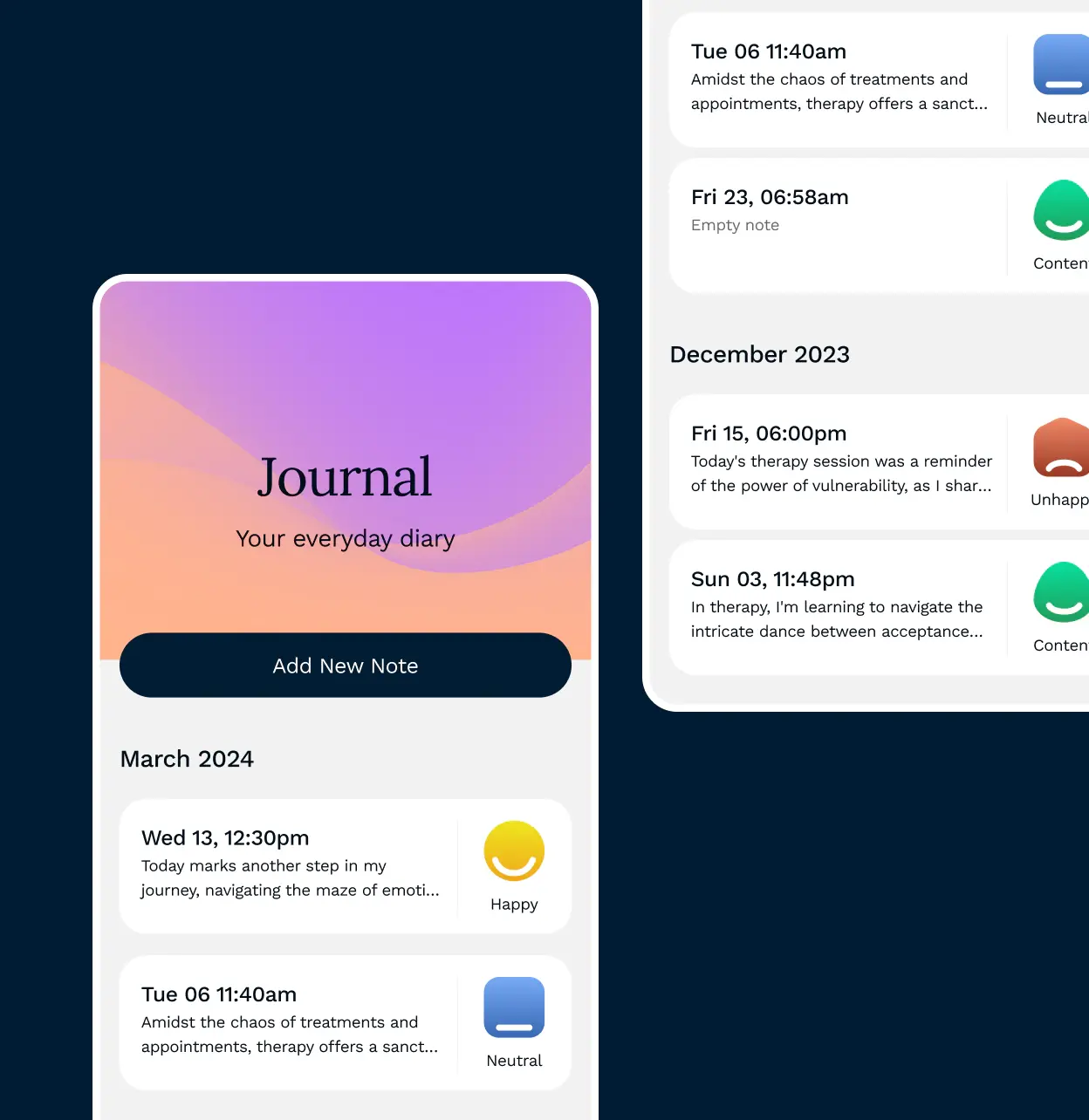
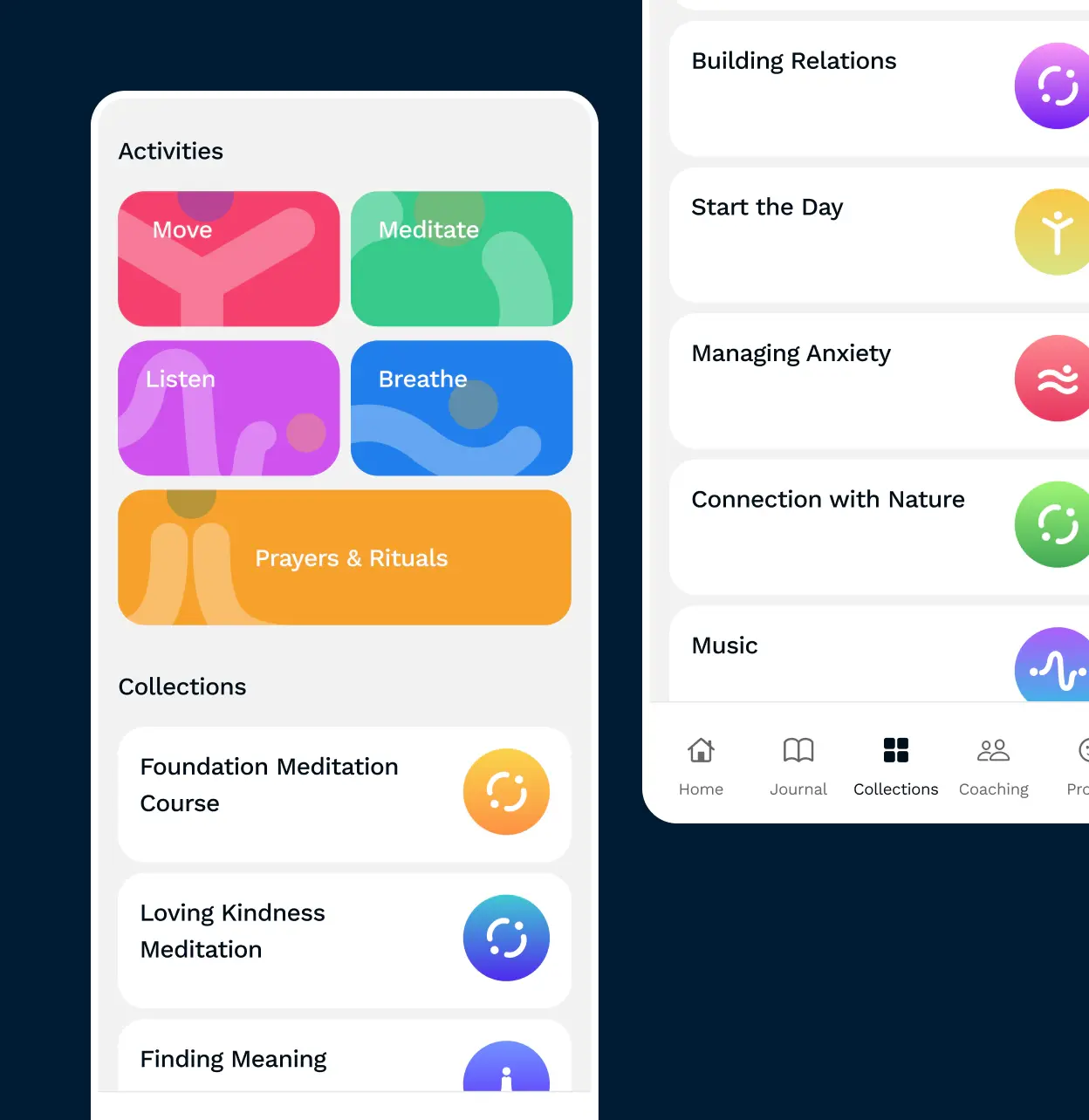
The redesign focused on improving the information architecture to better organize and expand content, including introducing new categories with video and audio resources. The main goal of the project was the development of a new Personal Plan algorithm that analyses patients' questionnaire answers and provides personalized content to further support cancer patients.
New Features
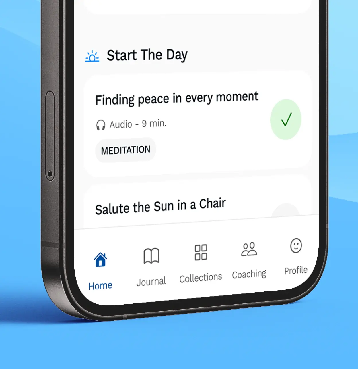
A new user-friendly dashboard provides a Personal Plan that is customized for each user via an algorithm, ensuring that each user receives a personalized experience tailored to their cancer care needs. This algorithm is designed to adapt the content according to the questionnaire responses, present content relevant to the time of day, and determine the appropriate volume of activities based on their significance.
Additionally, a new Coaching feature enables users to arrange one-on-one sessions with with coaches, chaplains and other cancer care specialists.
“At Natia, our aim is to create the ‘world’s kindest’ app for people diagnosed with and living with cancer and for their families and caregivers.”
.webp)
.webp)
.webp)
The Process
Online Workshop
The initial stage involved an online workshop aimed at defining the scope and identifying new features to be added to the app.
Research
The research phase focused on gathering insights through benchmarking and interviewing a leading cancer charity psychologist. The aim was to understand best practices in the field and gather expert opinions.
Design Phase
During the design phase, the team worked on improving the app's information architecture and defining user flows. Key tasks included designing the flow of an algorithm for the Personal Plan, Coaching feature, creating UX wireframes, and finalizing the UI design.
Implementation
The final phase involved technical development. Mobile developers updated the app and implemented the new designs, while back-end developers made necessary changes to the architecture and developed the algorithm for the Personal Plan.
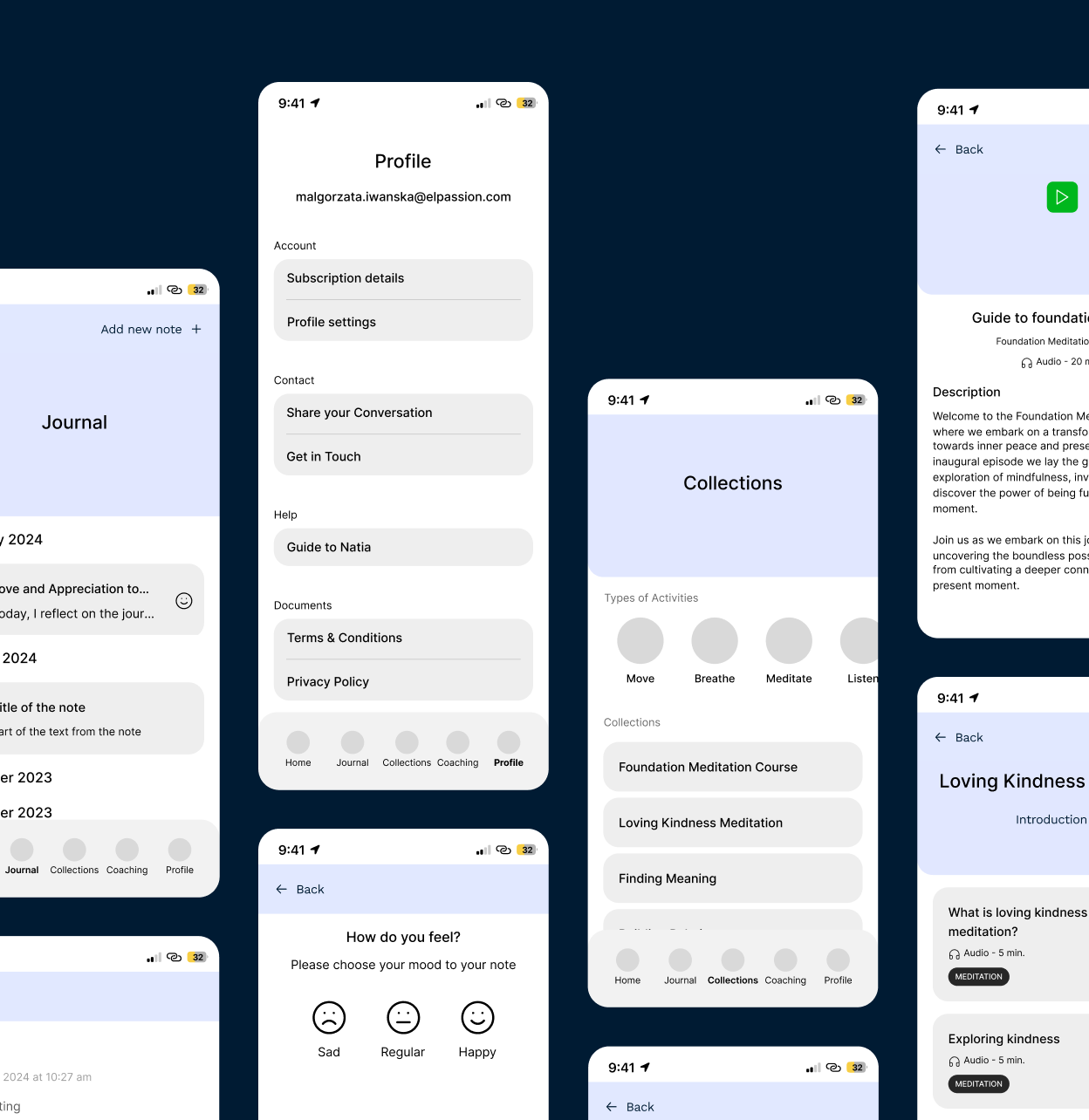
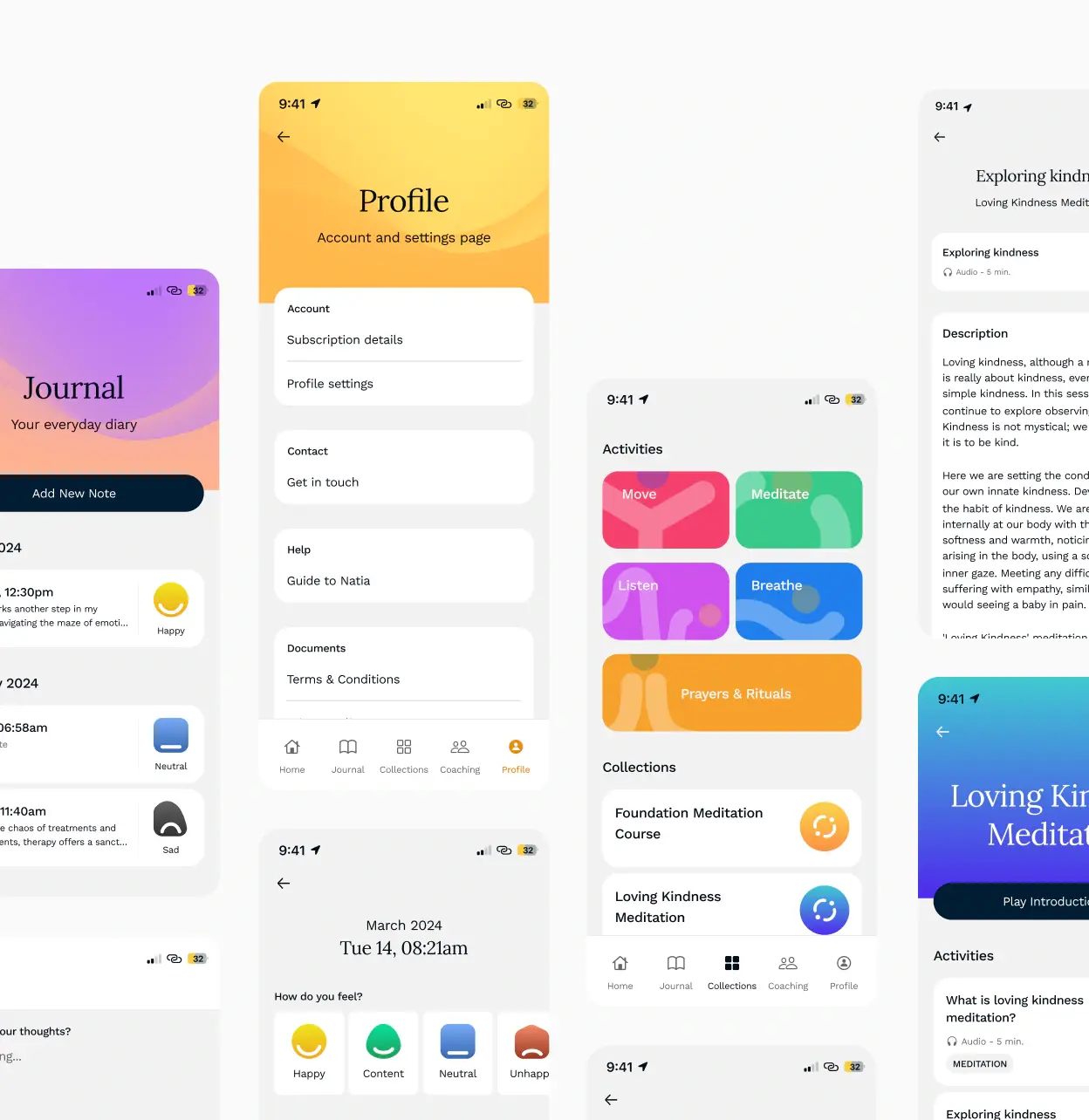
The greatest challenge was personalizing and developing the algorithm for Natia Cares. Now, users can access a 21-day Personal Plan filled with evidence-informed activities designed to enhance quality of life.
Tools
-
![figma]()
Figma
-
![ruby]()
Ruby on Rails
-
![swift-min]()
Swift UI
-
![aws@3x]()
AWS
Deliverables
-
App UX/UI Redesign
-
Revamped Information Architecture
-
New Coaching feature
-
Design and development of the Personal Plan feature


