Mednavi
Custom Medical Navigation for Cancer Patients
Expertise
UI & UX Design, Development, Branding
Platforms
Web & PWA
Industry
Healthcare
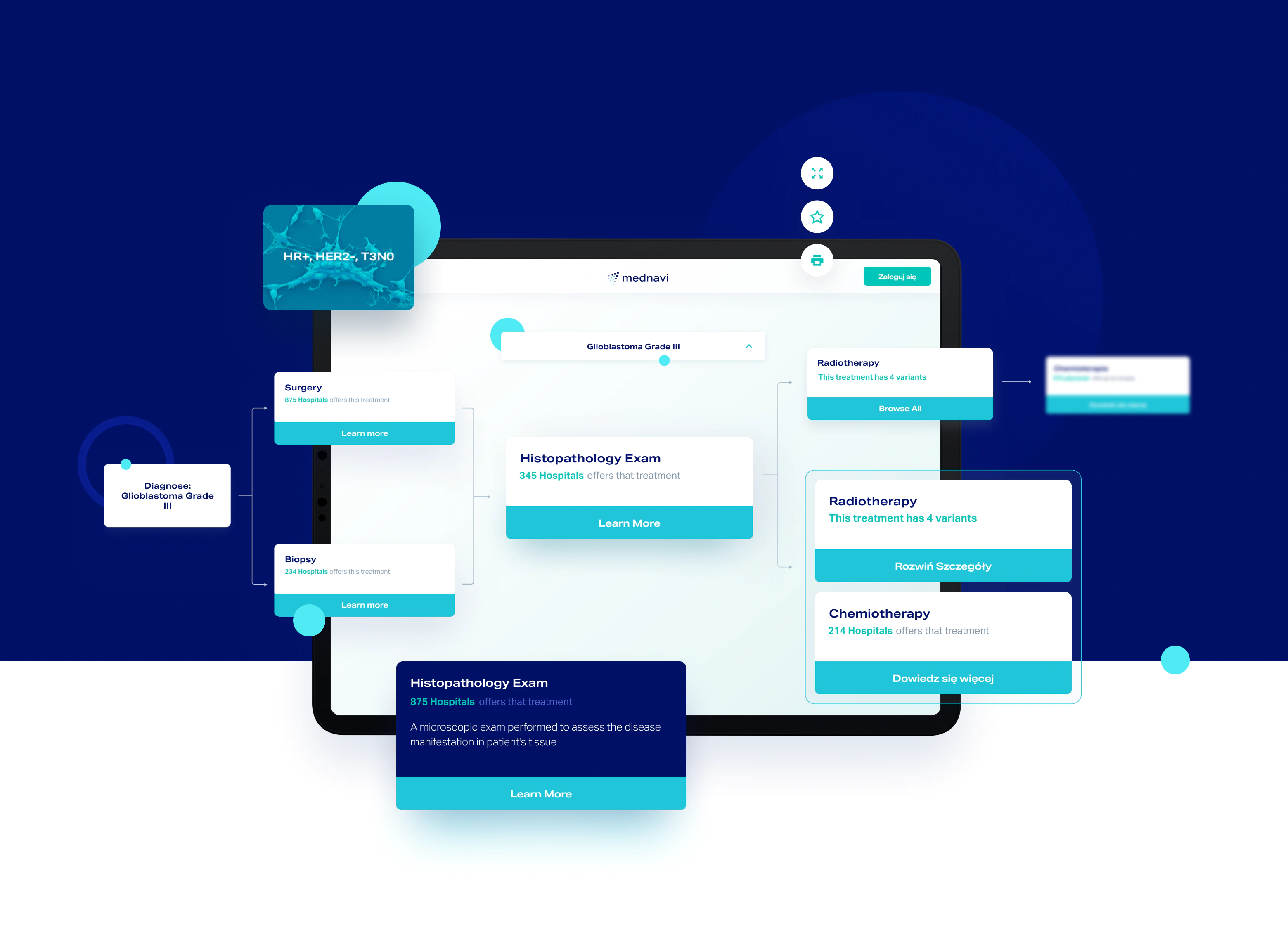
In the midst of hospital havoc, we created a solution enabling patients find the right treatment and facility for their type of cancer. From scratch.
The problem
The Polish healthcare system was lacking one complex tool comprising in-depth information on available cancer treatments in one place. Hospitals do not have one coherent knowledge transfer system that would enable sharing information between institutions or doctors. Many cancer patients felt as if they were left to themselves.
The main idea behind Mednavi is that knowledge is a door-opener and the first step to cancer recovery. The team wanted to create one solution arming patients with relevant information, not only about their disease, but also about the right treatment and treatment facility for their type of cancer.
The challenge
We faced the challenge of creating an intuitive and easy-to-use tool enabling cancer patients to quickly find answers to the most vital of questions: where and how they can be treated.
The goal was to show all possibilities in a clear and straightforward way so all users can understand and browse the app seamlessly and instinctively.
A clear direction with a Product Design Workshop
We created two separate personas, so prospective users characters that would use the app: people with cancer diagnosis, and their loved ones. This differentiation and empathy mapping proved to be key in the later product creation stage when we decided on the principal mednavi features.
We knew we had to create a tool that is not only functional and helps find treatment facilities, but is also a source of information users will trust and feel supported.
Intuitive User Experience and Clean Design
We knew Mednavi is going to be used by people in various age groups, often not very tech-savvy. We made intuitiveness and features’ accessibility our main design goals. Thanks to the thorough research backed up by in-depth user testing we were able to design an easy-to-use product meeting both, the user’s needs and the client’s business requirements.
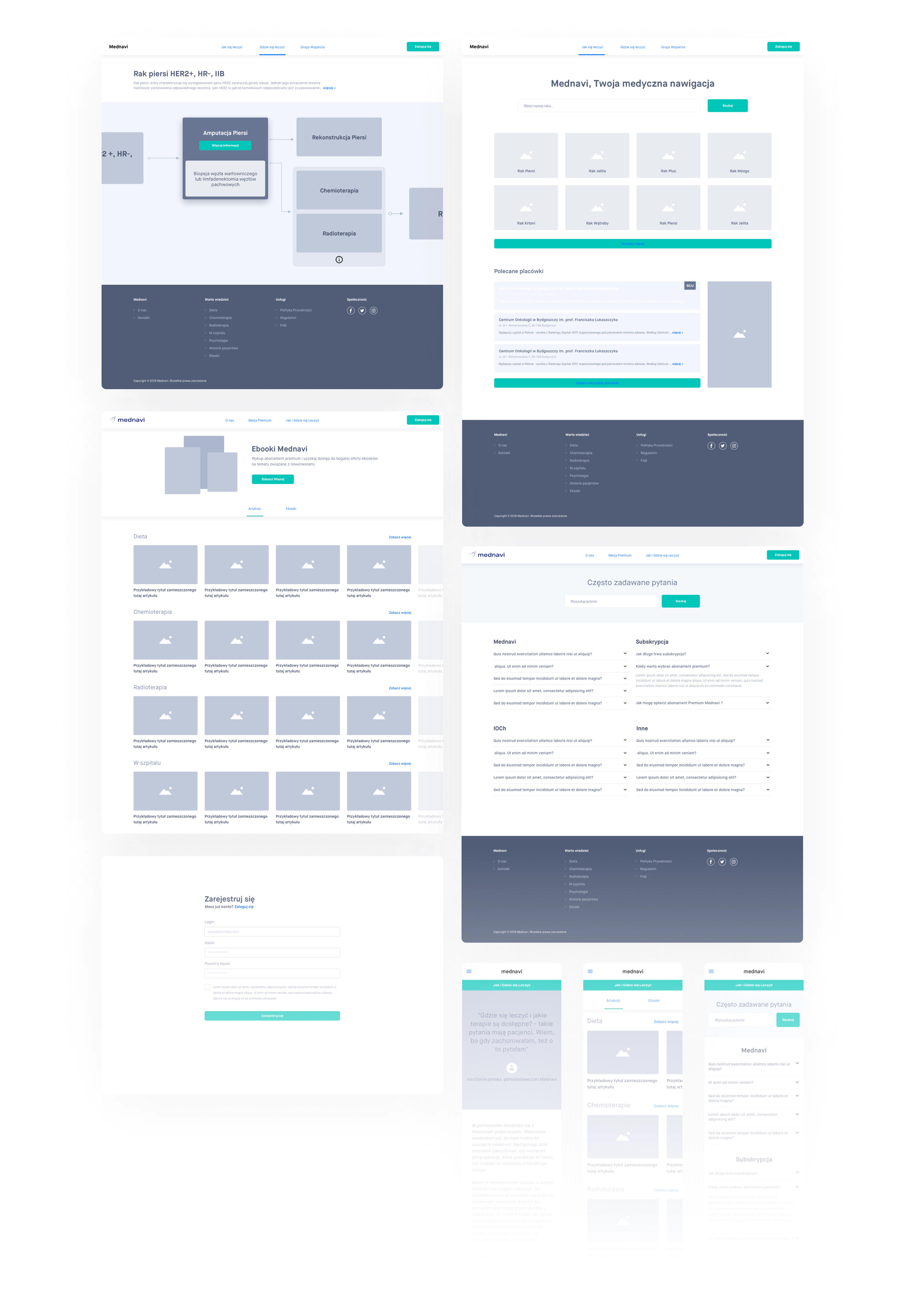
We understood the necessity of the mobile-first approach. Users search for answers just after leaving the doctors’ and this is when they have their first contact with the app.
Custom-made diagrams to navigate the treatment path
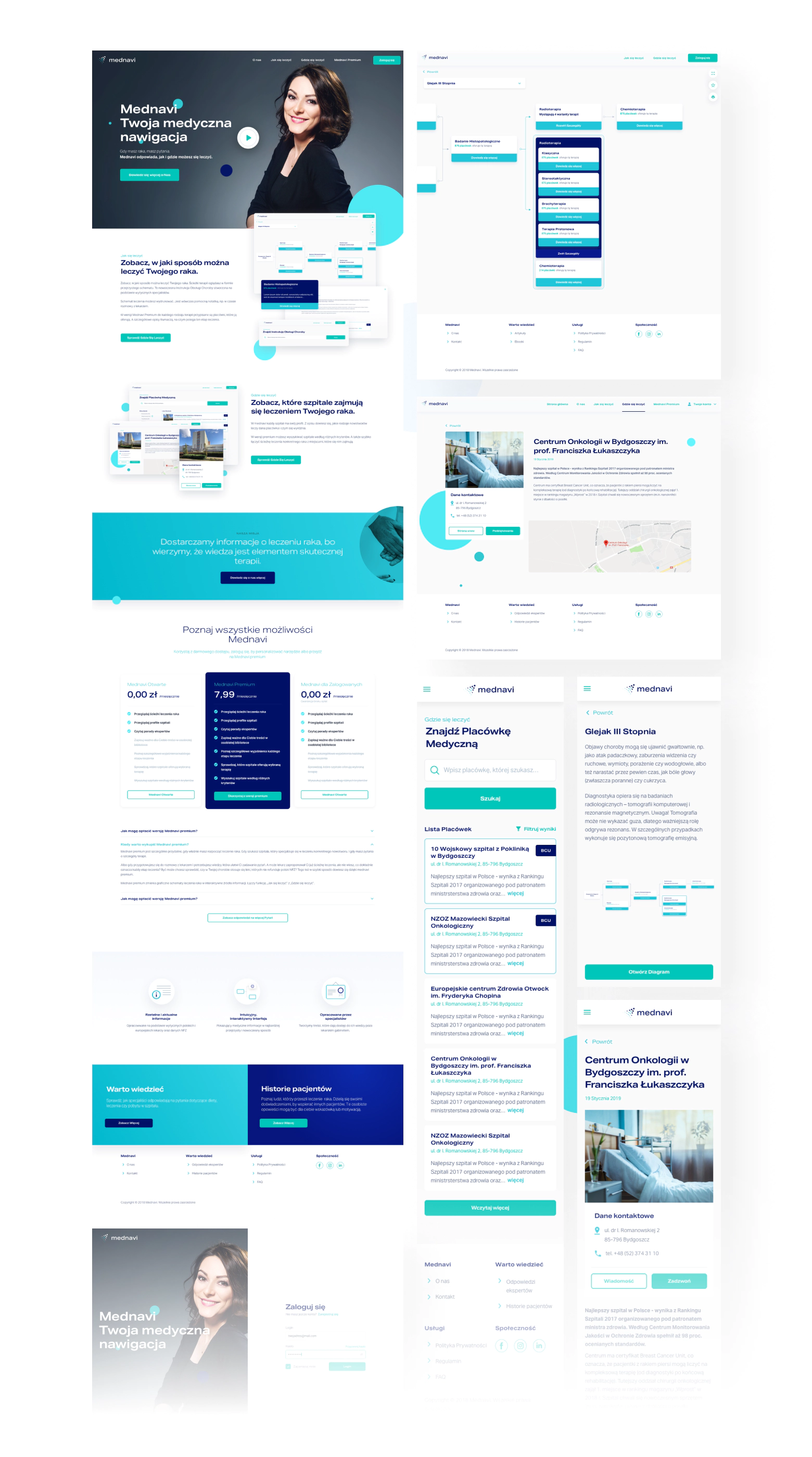
Every type of cancer is different. We wanted to make Mednavi a truly comprehensive medical navigation for patients. That’s why we created a custom diagram creator totally from scratch; so the Mednavi team is able to change and adjust every little segment if need be, from the level of their intuitive CMS. No need to get back to the code.
A PWA app for fully-functional mobile experience
Mednavi had to be a solution available for people no matter their operating system. To make the experience seamless for the patients, and quick and cost-effective for the Mednavi team, we decided to go with a PWA app. It allowed us to implement all needed mobile-first features, without the need to develop full native apps.
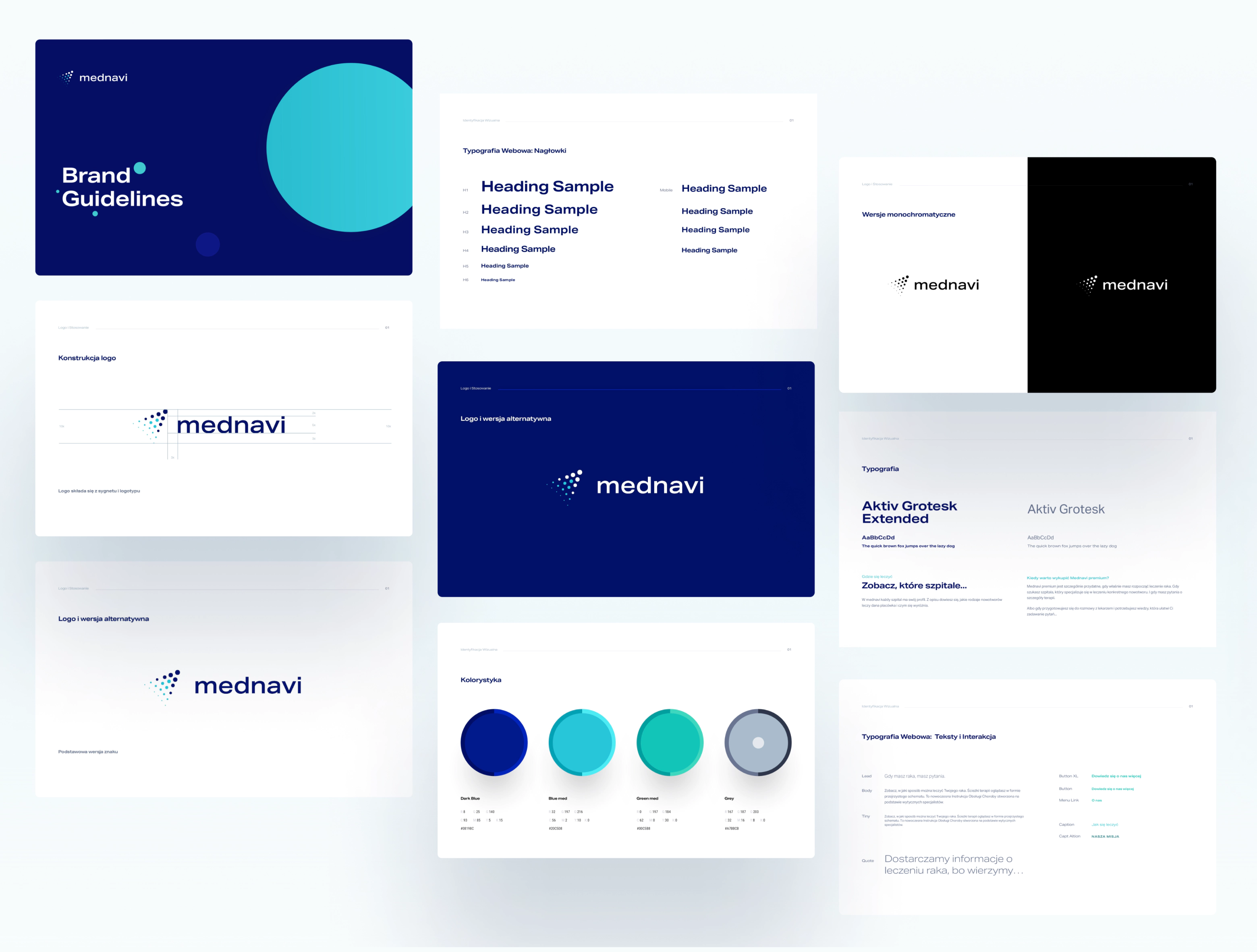
Strong brand identity enhancing trust
We created a modern and clean visual identity for the brand. The colors and the typography choices express professionalism and trust, strengthening mednavi’s position as a healthcare initiative.
They are creative when approaching challenges, and the results they deliver are impressive in terms of quality and time. EL Passion helped us with design and development, but they also gave our product vision a clear shape and form during a Product Design Workshop.
Tools
-
![ruby@3x]()
Ruby on Rails
-
![react@3x]()
React
-
![figma@3x]()
Figma
-
![sketch@3x]()
Sketch
Deliverables
-
A fully-functional Progressive Web App (PWA) application with 3500 active users and test coverage above 99% on the backend.
-
A full Brand book enhancing the brand’s strength and recognition from other services.
-
Custom-designed and custom-developed landing page.

