2 September 2020 (updated: 30 September 2020)
Designing a Product Information Management System. Part II: Deliverables
Chapters

Part II of the story of how we designed a tailor-made PIM system for an Enterprise. In 6 weeks.
In PART I, we focused on the Strategy and UX Design phase in the process of designing a Product Information Management Platform (PIM). Our work triggered digital transformation on a company level.
Now it's time to connect the dots and unveil the full picture of what we actually managed to achieve.
Syncing with the development team
Apart from back-end development, the design team needed alignment with the data science team. Their work, in turn, was focused on building realistic concepts of how the assistive AI functions of the PIM (more on that later).
The collaboration was important for the whole product team, especially to the designers, who did not want to build unrealistic product features. The PIM was supposed to be a start of the transformation, not a science-fiction promise.

Which features struck a chord with our end users?
In order for our concept of the product to be exciting for the company, we spent most of our time polishing very specific features.
The focus was on supporting core workflows of online merchandisers and product information teams.
Core feature 1: Dashboard
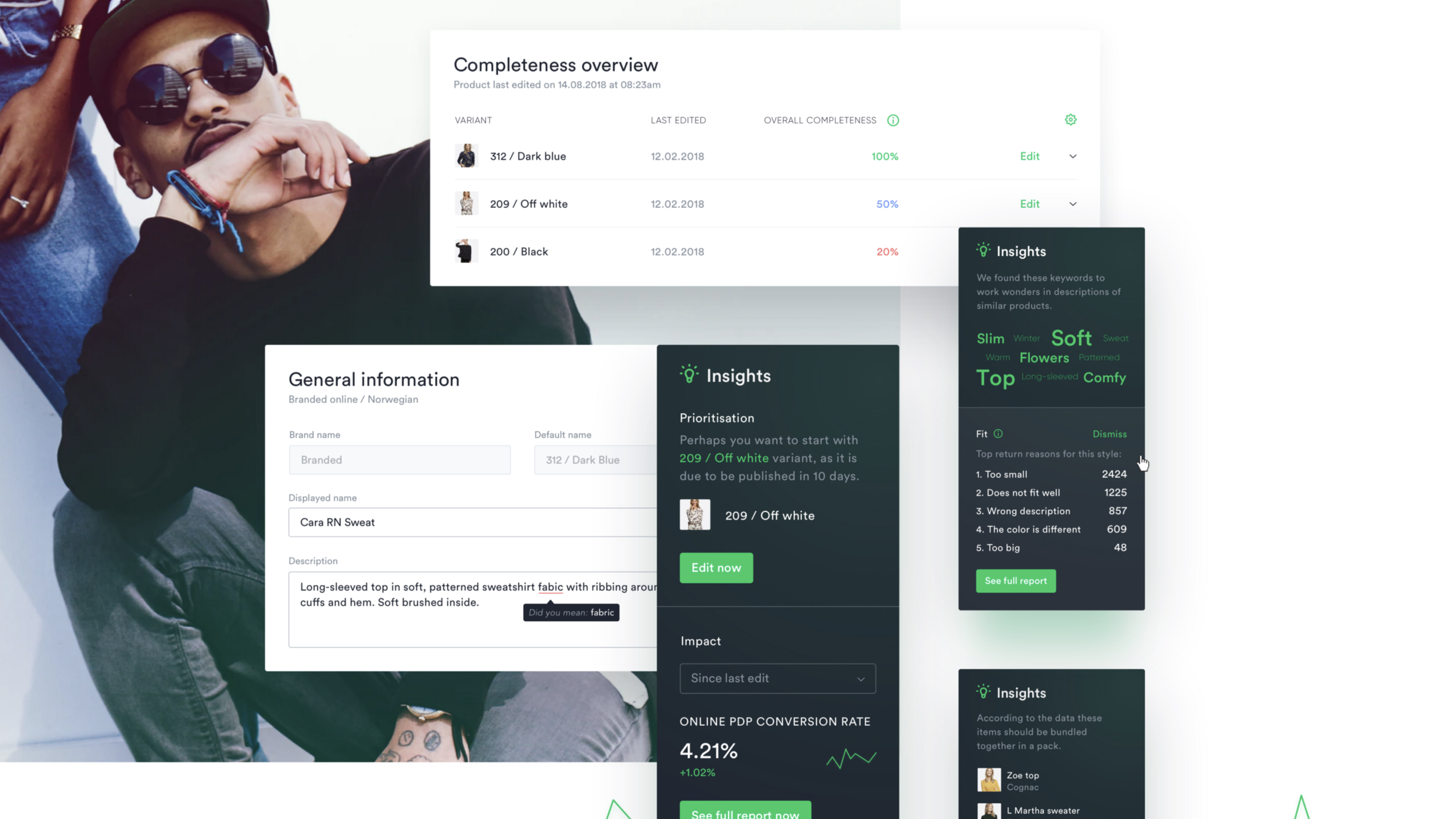
The starting point for a product content editor was a neat compilation of the tasks to do, urgent alerts and product analytics, to help them discover new products, but also see the impact of their effort.

Core feature 2: Product enrichment
We simplified the main functionality by using focused, sectioned web forms stripped down to the bare minimum.
People working with product information would now have all of the details of one product at hand, including:
- Variants (all variants of one product grouped together)
- Associations (similar products)
- Version control
- Publishing status

Core feature 3: Bulk editing
Imagine that you needed to change the colour group assigned to 50 products at a time (e.g. Beige > Desert). Instead of going one by one 50 times, you could do it once for all of the items.
This was the place where we could provide the most value to the client’s operations are bulk actions. We chose to go for the wizard approach, which was positively received by the users.
The crucial point about designing any bulk actions in enterprise systems is providing a precise summary of the changes applied.

Core feature 4: AI-powered Insights
Through collaboration with developers and data scientists, we were able to devise smart insights and suggestions to the users, in order to proactively use customer and sales data to enhance the quality of product information.

Sparking the digital transformation
After presenting the final prototypes and development assets to the key stakeholders, we were in a position to excite the organisation to dive deeper into the digital transformation.
Several retail operations systems were developed and designed in collaboration with EL Passion later on, which resulted in a paradigm shift for the company and its closest competitors.
UI Design
As a part of our work after the client project, we conducted an internal visual design sprint that produced the visual assets later used by us internally, by the client and, well, allowed us to showcase this case study in a more visually appealing way.
After establishing the visual system of the user interface we created one source of truth - detailed style guide which is just an introduction to building a dedicated design system. Below you can find a sneak peek of what it looks like.

The team that brought this to you:
- UX Strategy & UX Design — Michał Mazur, Aleksandra Bis
- UI Design — Ela Kumela, Jakub Dziedzic
- Case study — Tomasz Nadratowski
PART 1 of this case study is available here: Designing a Product Information Management System. Part I: UX Research.
Be sure to check out also:- Pioner Labs Behance Case Study for all the visuals not presented here
- Your App Needs a Product Design Workshop To Scale to see what we can achieve for your digital product with a Product Design Workshop
You may also like

Native vs Cross-Platform App Development: Which is Right for Your Business
3 September 2024 • Maria Pradiuszyk


